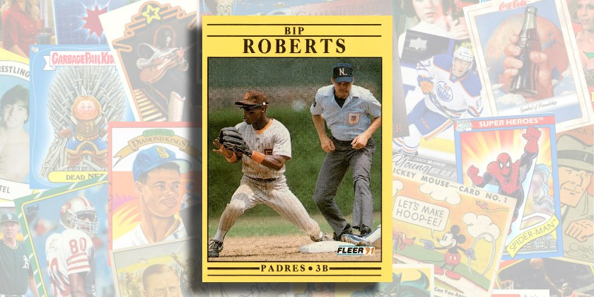
If you’re a card collector, you probably had a negative reaction to the title of this post, along the lines of “1991 Fleer SUCKS–how can there be a good card in the set?”
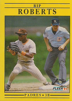
You’re not wrong, necessarily. They picked a bright yellow color that washes out the natural colors of the photos. They used a huge, plain font for the name that occupies a large section of the card. The design inspiration consists of…a series of plain black horizontal lines. None of these things is all that exciting.
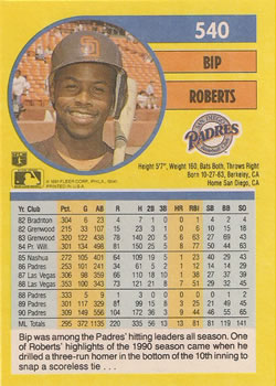
But this set does have some redeeming qualities, including some fantastic ones. The card backs feature a color headshot that is never taken from the same session as the photo on the front. Take Bip Roberts‘ card for example–action shot on the front, posed headshot on the back. Regular uniform on the front, batting practice jersey and helmet on the back. Up until 1991, this sort of two-photo arrangement hadn’t been seen much (although the initial sets from Score, which predated this set by a few years, did the same in lovely fashion.)
Now take a closer look at that photo on the front of Bip’s card. Aside from being too small because of Fleer’s layout choices, it’s pretty damned awesome. You’ve got a great action shot of Roberts, fingers spread, poised to receive the throw, a focused look on his face (bonus points for the flip-down sunglasses, too!). You’ve got a player sliding in to the bag–based on the color of his shoe and stirrup and the foliage in the background, I’m guessing this is a Cub playing in Wrigley field. And then there’s the umpire (Bill Hohn, I believe)–caught in the act of doing his job perfectly, head down right on the bag, watching to see whether the tag beats the runner.
That photo alone is worth some love. But then take a look at the back of the card. The design generally follows what Fleer had done most years up until that point, with basic stats and colored columns. They did a nice job connecting the card number to the circle around the photo, giving the card back a visual flow sorely lacking on the front. They fit in the MLB and MLBPA logos, as well as the team logo, and the bio data, and made great use of the space.
The little text section at the bottom is short and sweet, and you’ll notice it pre-dates use of the phrase “walk-off” to describe Roberts’ homer. The game mentioned was September 6th, 1990 (boxscore) and was one of three walk-off homers Bip bopped in his career. He also hit 4 homers leading off games as well as one inside-the-park homer, all in a career of just 30 total homers.
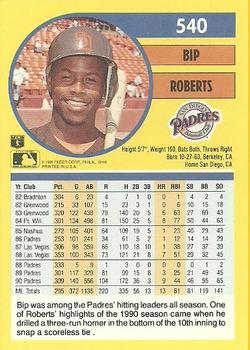
Here’s another funny thing about this card. After it was issued, Fleer issued an alternative version, show here:
The only difference is the 3 dots at the very end of the text section–on this version, it’s just one. I didn’t understand it when it was 3 dots with spaces between them, and I understand it even less now that it’s just a single dot with a space.
This set, like many Fleer sets since their inception, is riddled with errors and variations, and many of them are like this–correcting something that wasn’t even an error in the first place. My theory is that Fleer was trying to capitalize on the craze of the 1989 Fleer Billy Ripken fiasco by issuing pointless (but hopefully rare and collectible) variations.
Still don’t like 1991 Fleer? Consider yourself Bipped!
